
When you dive into data analysis, one of the fundamental questions you’ll likely ask is, How are these variables related? Understanding correlation is key to answering that question. Whether you’re working on a predictive model or exploring patterns in data, knowing how one variable changes in relation to another is crucial. And that’s where correlation metrics come in.
Now, you might have heard of both Spearman and Pearson correlations—two powerful tools used to measure the relationship between variables. But here’s the deal: each serves a different purpose depending on the data you’re dealing with. Pearson measures linear relationships, while Spearman digs deeper into ranked data and non-linear relationships. As you’ll see, picking the right method can significantly impact your analysis. In this blog, we’ll explore not only what makes these methods different but also how to choose the best one for your data.
Why is Correlation Important?
You’ve probably heard the saying, “Correlation does not imply causation.” While that’s true, it doesn’t take away from how vital correlation is in data science. At its core, correlation gives you a snapshot of how two variables move together. Are they in sync (positive correlation), moving in opposite directions (negative correlation), or completely unconnected?
Imagine you’re analyzing stock market data: understanding correlations between different stocks can help you spot trends, manage risk, and even build better trading strategies. Or take machine learning—correlation plays a big role in feature selection, helping you identify which variables are most useful for your model. The bottom line? Without understanding correlation, your data analysis is like shooting in the dark.
Goal of the Blog
In this post, I’ll guide you through a detailed comparison of Spearman and Pearson correlations. By the end, you’ll have a clear understanding of when to use each method and why. This blog is your go-to resource for making the right decision based on the data characteristics you’re working with. Ready to dive in? Let’s go!
Fundamental Concepts of Correlation
What is Correlation?
Let’s start with the basics. Correlation is all about relationships—it measures how one variable changes in response to another. In statistical terms, correlation tells you if there’s a mutual connection between two variables and how strong that connection is. For instance, if you notice that when ice cream sales go up, so do sunburn cases, you might suspect some form of correlation. However, you need to quantify that, and that’s exactly what correlation does.
The correlation coefficient—whether Pearson or Spearman—ranges from -1 to 1. A coefficient closer to 1 means a strong positive relationship (as one goes up, so does the other), while a coefficient closer to -1 indicates a strong negative relationship (as one goes up, the other goes down). If the coefficient is around 0, well, there’s not much of a relationship at all.
Positive vs Negative Correlation
You might be wondering, What do we mean by positive and negative correlation? Simply put, in a positive correlation, the variables move together in the same direction. For example, as hours of study increase, exam scores typically increase as well—this is a positive correlation.
On the flip side, in a negative correlation, the variables move in opposite directions. Think of a scenario where more time spent watching TV is linked to lower productivity. The more hours spent in front of the screen, the less work you get done—classic negative correlation.
Linear vs Non-Linear Relationships
Now, here’s where things get a bit more nuanced. Pearson correlation assumes that the relationship between variables is linear—meaning, if you plot the data on a graph, you’ll get a straight line. But real-world data doesn’t always work that way. Spearman correlation steps in when the relationship is monotonic but not necessarily linear. For example, a variable may consistently increase or decrease, but not in a straight-line fashion. Think of rankings in a competition, where the relationship between performance and ranking may be non-linear, yet still ordered.
So, choosing the right correlation method boils down to the type of relationship your data exhibits. Is it a straight line (Pearson)? Or is it a consistent increase/decrease without forming a straight line (Spearman)? As we move forward, I’ll break down each method in more detail so you can make that choice with confidence.
Pearson Correlation Coefficient
Definition
Let’s start with Pearson Correlation, which is probably the one you’ve encountered the most. It’s also known as the linear correlation coefficient, and it’s exactly what it sounds like—it measures the linear relationship between two variables. In simple terms, if one variable increases, does the other one increase in a straight-line pattern, or does it do something else?
To put it another way: Pearson tells you how well the points on a scatter plot fit a straight line. If the relationship is perfectly linear, the Pearson correlation will be +1 (if both increase together) or -1 (if one increases while the other decreases). If there’s no relationship at all, the Pearson coefficient will hover around 0.
Formula
Now, here’s where the math comes in. The formula for Pearson correlation is:

Let’s break that down:
- Cov(X, Y): This is the covariance between variables X and Y. Covariance measures how much two variables change together. If X and Y tend to increase together, the covariance will be positive; if one goes up while the other goes down, it’ll be negative.
- σ_X and σ_Y: These represent the standard deviations of X and Y. Essentially, they scale the covariance to account for the spread of each variable, making the result more interpretable.
What you’re left with is a number between -1 and 1 that represents how strongly X and Y are linearly related.
Assumptions
Here’s the thing about Pearson: it makes some pretty strict assumptions about your data.
- Linearity: Pearson only captures linear relationships, meaning it assumes the data points fall along a straight line. If your data has a curvy or complex pattern, Pearson won’t capture that well.
- Normally Distributed Data: Pearson works best when the data is normally distributed. If your data is heavily skewed, it could throw off the results.
- Interval or Ratio-Scale Data: Pearson requires that your data is measured on an interval or ratio scale (think continuous data, like temperature or height). It doesn’t work with ordinal data where the rankings are important but the distances between them aren’t.
When to Use Pearson Correlation?
So, when should you reach for Pearson? If your data is continuous, normally distributed, and the relationship you’re expecting is linear, Pearson is your go-to. For example, if you’re analyzing the relationship between study hours and test scores, and you expect the more hours someone studies, the higher their score will be, Pearson will give you a clear, interpretable result.
Another great use case is in feature selection for machine learning. If you want to understand how your input variables relate to your target variable and you expect these relationships to be linear, Pearson is an ideal metric.
Advantages
- Simplicity: Pearson is straightforward and interpretable. You get a number between -1 and 1 that’s easy to understand, especially when you’re dealing with linear relationships.
- Widespread Usage: Pearson is used across disciplines—from economics to physics to machine learning—so its results are well-understood and accepted.
Disadvantages
But Pearson has its drawbacks, too:
- Sensitive to Outliers: A single extreme data point can dramatically skew Pearson’s results. If your data has outliers, you might want to think twice about using Pearson.
- Not Suitable for Non-Linear Relationships: If your data doesn’t follow a linear pattern, Pearson’s results will be misleading. You’ll either see a weak correlation or none at all, even if there’s a clear but non-linear relationship.
- Scale Sensitivity: Pearson is also sensitive to the scale of the data. If one variable has a much larger range than the other, it could distort the correlation.
Spearman Correlation Coefficient
Definition
Now, let’s shift gears to Spearman correlation, which is a non-parametric measure of rank correlation. What does that mean? Well, Spearman doesn’t care about the actual values of your data points. Instead, it ranks them first and then measures how well those ranks are related.
Here’s the deal: while Pearson measures how variables change in a linear fashion, Spearman measures how they move in relation to each other, regardless of whether the relationship is linear or not. This makes Spearman perfect for capturing monotonic relationships—those where one variable consistently increases or decreases with the other, but not necessarily in a straight line.
Formula
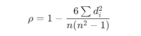
The Spearman correlation coefficient can be calculated with this formula:

Where:
- d_i is the difference between the ranks of corresponding values of X and Y.
- n is the number of observations.
Instead of working with the raw data, Spearman assigns ranks to each value, and then it calculates the correlation based on those ranks. So, if your data is messy or has a lot of outliers, Spearman’s ranking system can give you a more robust understanding of how the variables are related.
Assumptions
The beauty of Spearman correlation is that it makes fewer assumptions than Pearson.
- No Assumption of Linearity: Spearman doesn’t require the relationship between variables to be linear. As long as the relationship is monotonic (always increasing or always decreasing), Spearman will capture it.
- Ordinal, Interval, or Ratio-Scale Data: Unlike Pearson, Spearman can handle ordinal data, where the order of values is important but the exact differences between them are not. This makes it more versatile for datasets that include rankings or non-continuous values.
- Less Sensitivity to Outliers: Because Spearman is based on ranks rather than actual values, it’s much less sensitive to outliers than Pearson.
When to Use Spearman Correlation?
You might be wondering, When should I use Spearman over Pearson? If your data is non-linear, ordinal, or skewed, Spearman is your best bet. For example, if you’re studying the relationship between job satisfaction and income, but the relationship isn’t linear—say, satisfaction plateaus at higher income levels—Spearman will capture that trend, whereas Pearson might miss it.
Another example is when you have data with outliers. Suppose you’re measuring the relationship between age and reaction time, and you have some older individuals with unusually slow reaction times. Spearman would be less affected by those outliers than Pearson.
Advantages
- Works for Non-Linear Relationships: Spearman shines when the relationship between variables isn’t linear but still shows a consistent trend (monotonic relationship).
- Robust Against Outliers: Since it ranks data, Spearman is much more resilient to outliers.
- Handles Ordinal Data: If you’re working with ordinal data (like rankings or grades), Spearman is the better choice.
Disadvantages
- Less Powerful for Linear Data: If your data is clearly linear, Spearman won’t perform as well as Pearson. It’s designed to capture rank-order relationships, not precise linear associations.
- May Not Reflect the Strength of Linear Relationships: Because Spearman ranks data, it can’t capture the magnitude of relationships the way Pearson does. So, while it can tell you if there’s a relationship, it might not be as clear on how strong that relationship is in terms of real values.
Key Differences Between Spearman and Pearson Correlation
When it comes to deciding between Spearman and Pearson correlations, understanding their differences can save you a lot of time—and perhaps a few headaches. You might be tempted to think they’re interchangeable because both measure relationships between variables, but they serve very different purposes based on the nature of your data.
Nature of the Relationship
Here’s the first major distinction: Pearson captures linear relationships, while Spearman measures monotonic relationships.
Let me explain. Pearson is ideal when you’re looking for a straight-line relationship. Imagine you’re tracking temperature and ice cream sales. As temperature rises, ice cream sales rise—if this relationship is linear, Pearson is going to capture that beautifully. But here’s the catch: Pearson assumes that the change is consistent—so a 1-degree increase in temperature always leads to a predictable increase in sales.
On the flip side, Spearman doesn’t care if the relationship is linear; it only cares if it’s monotonic. In other words, if ice cream sales consistently increase as temperature increases (even if the increase isn’t at a constant rate), Spearman will still pick up on that trend. Spearman is more flexible in this way—it’s there for you when the data doesn’t form a perfect straight line.
Data Sensitivity
Now, this might surprise you: Pearson is sensitive to outliers and assumes that the data is normally distributed. Think of Pearson as a delicate tool—it works well when the data is clean and follows a normal pattern. But introduce a couple of outliers, and suddenly, the results can be skewed. For instance, if you have a few data points way outside the normal range, Pearson might give you a weaker correlation than actually exists between your variables.
Spearman, on the other hand, is more robust because it’s based on ranks rather than the actual values. Spearman can handle those pesky outliers much better. It won’t get easily distracted by one or two extreme values because it’s only focusing on how the ranks of the data relate to each other. This makes Spearman a better choice when your data has outliers or is skewed.
Use Cases
So, when should you use which? Here’s a simple rule of thumb:
- Use Pearson when your data is normally distributed and measured on an interval or ratio scale. It’s ideal for linear relationships in continuous data—think temperature, height, or time.
- Use Spearman when your data is ordinal, non-linear, or skewed. It’s especially useful for ranked data or when you expect a consistent trend but not necessarily a straight-line relationship.
For example, if you’re studying the relationship between movie rankings and box office success, Spearman would be your friend. But if you’re trying to find a linear relationship between years of experience and salary in a certain profession, Pearson might give you a more accurate picture.
Impact of Data Transformation
Here’s something you might not have thought about: data transformation can drastically change the results of your correlation analysis. In Pearson, the raw values matter. So, any transformation like log or square root might alter the results, depending on how it affects the linearity of the data.
With Spearman, since we’re dealing with ranks, transforming the data values doesn’t have the same effect—because Spearman only cares about the order of the values, not the actual values themselves. For instance, ranking your data before using Spearman can help you capture relationships that might be hidden if you only looked at the raw data.
Mathematical Comparison
To truly appreciate the differences between Pearson and Spearman, let’s take a closer look at the math.
Detailed Comparison of Formulas
- Pearson Formula:

Pearson’s formula uses covariance to measure how two variables change together, divided by the product of their standard deviations. It’s all about how the actual values relate to each other.
Spearman Formula:
- Spearman, on the other hand, ranks the values of X and Y and then calculates the differences in these ranks (d_i). It uses those differences to measure the degree of association. The result is a rank-based measure of correlation.
Here’s the key takeaway: Pearson focuses on the actual values, while Spearman focuses on the ranks. Pearson will give you the exact nature of the relationship if it’s linear, but Spearman gives you a more general sense of how the two variables move together, regardless of whether the relationship is linear.
Geometric Interpretation
If you’re a visual thinker, this will make sense: Pearson can be thought of geometrically as measuring the angle between two data points in a scatter plot. If the points form a straight line, the angle between them will reflect a perfect correlation.
For Spearman, the idea is less about angles and distances and more about ranking. Spearman doesn’t care if the points form a straight line; it only cares that higher ranks of one variable correspond to higher ranks of the other. This makes Spearman less affected by the actual distances between points, which is why it’s less sensitive to outliers.
Practical Example
Let’s walk through a quick example. Say you’re analyzing the relationship between years of education and salary. For simplicity, here’s a small dataset:

Now, if you apply Pearson correlation, you’d get a coefficient that reflects the linear relationship between education and salary. Pearson might give you a result of, say, 0.9, indicating a strong positive linear relationship.
But what if the relationship isn’t perfectly linear? Maybe, after 16 years of education, salaries plateau because additional qualifications don’t translate directly into higher pay. In this case, Spearman correlation might give you a slightly different picture. After ranking the data and calculating the differences in ranks, you might find a Spearman coefficient closer to 0.85, showing a strong but non-linear monotonic relationship.
By seeing how Pearson and Spearman handle this same data, you can better understand the nuances in how they interpret relationships. In some cases, they’ll agree closely, but in others, Spearman might highlight a relationship that Pearson misses.
With this breakdown, you now have a solid grasp of not only the theoretical differences between Pearson and Spearman but also the mathematical and practical differences. Each serves a distinct purpose, and knowing when to use each method gives you a powerful edge in analyzing your data.
Visualization of Correlations
When analyzing correlations, visuals often tell the story in a way numbers alone can’t. By using the right plots, you can instantly grasp the nature of the relationship between variables and understand how different correlation metrics behave.
Scatter Plots
Let’s start with scatter plots—your best friend when it comes to visualizing relationships.
- Linear Relationships (Pearson’s Sweet Spot): Imagine you’re looking at a scatter plot where the points form a straight line—this is where Pearson correlation shines. If both variables increase together, the points will line up, indicating a strong positive Pearson correlation (close to +1). If one variable increases as the other decreases, the points will slant in the opposite direction, signaling a negative Pearson correlation (close to -1).Example: Think about the relationship between height and weight in adults. Generally, as height increases, weight increases, forming a linear pattern that Pearson would capture perfectly.
- Monotonic but Non-Linear Relationships (Spearman’s Territory): Now, let’s say you plot two variables, and while they both increase together, the relationship isn’t perfectly straight—it curves. This is where Spearman steps in. Even though the pattern is not linear, Spearman will still identify the consistent increase (or decrease), capturing the monotonic relationship.Example: Picture the relationship between age and income. Up to a point, income rises with age, but after a certain point, it plateaus. Pearson might struggle to capture this trend accurately, but Spearman will detect the consistent upward trend, even if it isn’t a straight line.
- Outliers and Correlation Behavior: This might surprise you: scatter plots can also reveal how each method handles outliers. Let’s say you have a scatter plot with most points forming a tight cluster, but a few points are far away from the rest. Pearson will be skewed by those outliers, reducing the overall correlation coefficient. However, Spearman, since it ranks the data, won’t be as affected by those distant points.Example: If you’re analyzing the relationship between income and years of education but a few individuals have extremely high incomes, those outliers could distort the Pearson correlation, making it seem weaker than it is.
Heatmaps and Correlation Matrices
When you’re dealing with multiple variables, scatter plots for each pair can get messy. This is where heatmaps and correlation matrices come in handy. A heatmap is a visual representation of correlation coefficients where color indicates the strength of the correlation—dark colors might represent strong correlations, while lighter shades represent weaker ones.
- Pearson for Linear Data: If most of your data is linear, you can use a Pearson-based heatmap to visualize how variables relate to each other. It’s common in fields like finance to see heatmaps displaying Pearson correlations between different stocks or economic indicators.
- Spearman for Non-Linear or Ranked Data: When your data is non-linear or ranked, Spearman-based heatmaps can provide insights into relationships that Pearson might miss. In bioinformatics or psychology, where ordinal or non-linear data is more common, these visualizations are invaluable.
Practical Considerations
When applying Pearson or Spearman correlations in real-world scenarios, there are a few things you should always keep in mind:
Outliers
Outliers are a tricky beast. If your data has extreme values, Pearson correlation can be heavily influenced. One or two outliers can drag the correlation coefficient toward 0, even if most of the data shows a strong relationship. Spearman, because it focuses on ranks rather than the values themselves, is far less sensitive to outliers.
- Handling Outliers: If outliers are distorting your Pearson correlation, you might consider removing or transforming the data before calculating the correlation. Alternatively, switching to Spearman correlation can provide a clearer picture if the outliers are meaningful but shouldn’t skew your results.
Non-Normal Data
This might surprise you: Pearson correlation assumes that your data follows a normal distribution. If your data is heavily skewed or exhibits non-normal patterns, Pearson might not be the right tool. Spearman, however, doesn’t care about normality. It’s a non-parametric method, meaning it works well even when the data violates normal distribution assumptions.
- When to Use Spearman: If you’re working with data that’s skewed, ranked, or has a lot of variability, Spearman should be your go-to. For example, in social sciences, where survey data is often ordinal and not normally distributed, Spearman will give you more reliable results.
Data Type & Scale
Data type plays a big role in choosing the right correlation.
- Ordinal Data: If you’re working with ordinal data (think rankings or scores that don’t have equal intervals between them), Spearman is the best choice. Spearman doesn’t care about the exact values, just the order of the data points.Example: If you’re analyzing movie rankings across different reviewers, Spearman will capture how closely those rankings align, even if the intervals between ranks aren’t equal.
- Interval/Ratio Data: If your data is on an interval or ratio scale and follows a linear pattern, Pearson should be your first choice. It’s particularly useful when you need to measure the strength of a linear relationship, as in econometrics or engineering.
Applications in Machine Learning
Understanding correlations is more than just academic—it has real-world applications, especially in machine learning. Let’s explore how both Pearson and Spearman come into play:
Feature Selection
In machine learning, you often deal with a large number of features. Correlation can help you narrow down the most relevant ones. Pearson correlation is a popular method for feature selection when you expect linear relationships between your input variables and the target. By calculating the Pearson correlation between each feature and the target variable, you can drop features that have a weak correlation, improving your model’s performance.
- Spearman for Ranked or Non-Linear Data: In cases where your features might have non-linear relationships with the target, Spearman correlation becomes useful. For example, in decision trees or ensemble methods, where the relationship between features and the target can be non-linear, Spearman may provide more insight into feature importance.
Predictive Modeling
Correlation is also relevant in regression analysis, where you’re modeling the relationship between variables. For linear regression models, Pearson correlation helps identify which features are linearly related to the target.
In non-linear models, like support vector machines or neural networks, Spearman correlation can help you better understand how features that have non-linear relationships with the target variable still contribute to predictions.
Domain-Specific Applications
- Pearson in Econometrics, Finance, and Physical Sciences: In fields where relationships are typically linear, Pearson is widely used. For example, in finance, you might calculate the Pearson correlation between two stocks to assess how their returns move together. In physical sciences, Pearson is used to examine relationships like temperature and pressure, where linearity is often assumed.
- Spearman in Social Sciences, Bioinformatics, and Psychology: In domains where data is often ordinal or the relationships aren’t linear, Spearman is the preferred choice. In bioinformatics, Spearman correlation helps identify relationships in gene expression data, while in psychology, it’s used to analyze survey data where responses are ranked but not evenly spaced.
Performance and Computational Complexity
When working with large datasets, you need to consider how efficiently your chosen correlation method can be computed. Let’s break down the computational differences between Pearson and Spearman, especially when it comes to performance.
Computational Differences
You might be surprised to learn that Pearson correlation is computationally simpler than Spearman. Why? Because Pearson’s formula only involves basic operations: calculating covariance and dividing by the product of standard deviations. It’s straightforward—just plug in the values, compute the covariance, and you’re done.
Spearman, however, involves an extra step. Before you even calculate the correlation, you first have to rank the data, which can be a bit more computationally demanding, especially with larger datasets. Ranking introduces a layer of complexity that makes Spearman slower in comparison to Pearson, particularly when your data grows in size.
- Pearson’s Time Complexity: Generally, Pearson correlation has a time complexity of O(n), where
nis the number of data points. This linear relationship makes Pearson a good fit for large-scale datasets when you expect a linear correlation. - Spearman’s Time Complexity: For Spearman, the ranking process adds a step, making it slightly more complex. The time complexity for Spearman is typically O(n log n) because of the sorting required to rank the data before calculating the correlation. For small datasets, this won’t make much of a difference, but as your dataset grows, this added complexity becomes more noticeable.
Scalability
As your datasets get larger, you’ll need methods that scale well. Luckily, modern tools like Python and R have optimized libraries that handle these computations efficiently, even for massive datasets.
- Python: In Python, both Pearson and Spearman correlations can be computed using the
scipy.statsorpandaslibraries. For example,pandasuses highly optimized internal algorithms that make these calculations faster than if you were to implement them from scratch. For datasets with millions of rows, Python’s libraries can compute Pearson in a fraction of a second, and even Spearman with its ranking step will still be manageable. - R: R’s
corfunction is similarly optimized for both Pearson and Spearman, scaling efficiently with larger datasets. The difference in computational time between the two methods might be noticeable, but still minimal for most practical purposes, thanks to R’s well-optimized statistical functions.
For extremely large datasets, distributed computing tools like Dask (in Python) or Spark can parallelize these operations, allowing you to handle billions of rows without significant performance degradation. So, whether you’re calculating Pearson or Spearman, modern libraries and distributed systems ensure scalability isn’t a bottleneck.
Conclusion
Summary of Key Differences
Let’s recap the most important points we’ve covered:
- Pearson Correlation is perfect when you’re working with linear relationships and normally distributed data. It’s computationally simpler and widely used in cases where both the data and the relationship between variables are continuous and linear.
- Spearman Correlation shines in situations where the data might not be linear or when the relationship is monotonic but non-linear. It’s also your go-to method for ordinal data and is more robust to outliers than Pearson.
Both methods serve different purposes and excel under different circumstances. So the key is to understand your data and the type of relationship you’re trying to capture.
Final Thoughts
Here’s the deal: when deciding between Pearson and Spearman, think about the nature of your data first. Are you working with clean, continuous, normally distributed data where you expect a linear relationship? If so, Pearson will be fast, efficient, and effective.
But if your data is skewed, ordinal, or you’re expecting a non-linear trend, Spearman should be your choice. It will give you a more accurate reflection of the relationship, especially in real-world situations where things aren’t always linear.
My advice? Always start with visualizations—use scatter plots and heatmaps to get a sense of the data. Then, decide whether the linear simplicity of Pearson or the robustness of Spearman is the better fit for your analysis. And remember, in many cases, it’s worth computing both and comparing the results!