
Let’s start by addressing the elephant in the room: high-dimensional data. You’ve probably encountered this problem when working with datasets that have hundreds or thousands of features. Now, imagine trying to find patterns or insights in that mess—it’s like trying to navigate a dense forest without a map. This is where dimensionality reduction becomes your best friend.
Dimensionality reduction is the process of simplifying your dataset without losing essential information. Think of it as decluttering your workspace—removing what’s unnecessary so you can focus on what truly matters. You do this to:
- Avoid overfitting, where your model starts capturing noise instead of the actual signal.
- Reduce computational costs, because fewer dimensions mean less time spent on processing.
- Make your models generalize better to new data.
The Magic of PCA
Here’s the deal: One of the most popular techniques for dimensionality reduction is Principal Component Analysis (PCA). In simple terms, PCA helps you identify the key directions (or “components”) where most of the variance (information) in your data lies, and then it projects your data onto these directions. It’s like finding the best camera angle to capture the essence of an object with minimal distortion.
Why is PCA so widely loved? Because it’s versatile. You’ll see it used in fields like image processing (reducing the number of pixels you need to analyze without losing clarity), genomics (handling complex gene expression data), and even finance (finding hidden patterns in stock market data).
Purpose of This Blog
By the time you finish reading this blog, I’ll have walked you through everything you need to know about PCA, from the theory to the mathematical nitty-gritty, and finally, how to implement it practically using Python. So whether you’re new to PCA or just need a refresher, you’re in the right place.
Why Dimensionality Reduction is Important
You might be wondering, “Why should I even bother reducing dimensions?” Let me explain.
Curse of Dimensionality
Here’s something that might surprise you: More data isn’t always better. As the number of features in your dataset grows, the data points spread out, becoming sparser in the high-dimensional space. This makes it harder for your machine learning model to identify meaningful patterns because distance metrics (which most algorithms rely on) become less reliable. We call this the curse of dimensionality. The more features you have, the more your model struggles to generalize. This leads to:
- Overfitting: Where your model becomes too specific to the training data and performs poorly on new data.
- Poor generalization: Your model can’t make accurate predictions on unseen data.
- Increased computational cost: With each new feature, you’re adding more calculations, which means more time and resources spent training your model.
Model Simplification and Interpretability
Let’s be honest: complex models are hard to explain. And if you’re in an industry like healthcare or finance, you need to justify your model’s predictions. By reducing dimensions, you simplify your model, making it more interpretable and, frankly, more trustworthy.
Take PCA, for instance—it condenses a large number of correlated variables into a few uncorrelated principal components. It’s like reducing the number of ingredients in a recipe without compromising the taste.
Efficiency
Now, this is a big one. Less data means faster training times. When you remove redundant or irrelevant features, you speed up your machine learning pipeline. That’s a win-win—faster results and lower computational costs.
Visualization
Finally, let’s talk about visualization. If your dataset has more than three dimensions, visualizing it becomes impossible. By reducing your data to 2D or 3D using PCA, you can plot it and actually see the clusters, relationships, or patterns that were previously buried. You might even uncover insights you didn’t expect.
By now, you should see why dimensionality reduction is not just a fancy term but a crucial part of any data science toolkit. In the next section, we’ll dive deeper into the magic of PCA and how it works under the hood. Ready? Let’s go.
What is Principal Component Analysis (PCA)?
Intuitive Explanation
Let’s break it down with something you might relate to. Imagine you’re taking pictures of a 3D object, like a sculpture, but only from a 2D camera lens. What you want is the best possible shot that captures the essence of the sculpture without losing too much detail. That’s exactly what PCA does for your data.
Here’s the deal: PCA takes your high-dimensional data and projects it onto fewer dimensions—while retaining most of the information. Instead of dealing with hundreds of features, you’re now working with just a few key components, which still capture most of the variance (or important patterns) in your data.
Think of it as summarizing a book—you might skip a few chapters, but you keep the key points intact.
Mathematical Explanation
Alright, time to dive into the math. Don’t worry—I’ll walk you through it step by step.
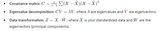
Eigenvectors and Eigenvalues: You might be wondering, what role do these play? Well, eigenvectors are the directions in which your data varies the most. Eigenvalues, on the other hand, tell you how much variance there is in each direction. So, the higher the eigenvalue, the more important that direction is for explaining your data. These eigenvectors become your new axes, which we call principal components.
Covariance Matrix: The covariance matrix is at the heart of PCA. It captures how much two features (or variables) vary together. If two features are highly correlated, PCA will identify that and consolidate them into one component, reducing redundancy. It’s like finding out that two tools in your toolbox can do the same job—you only need to keep one!
Geometrical Interpretation
Picture this: PCA finds new axes for your data by rotating the original axes to align with the directions of maximum variance. So instead of looking at your data through the old features, you’re now seeing it through these new principal components—clean, concise, and more informative.
Variance Retention
Now, the key question: How much of your data’s original information is preserved? PCA tries to retain as much variance as possible. The first few principal components usually capture most of the variance, meaning you don’t lose much even when you reduce dimensions. It’s like keeping 90% of the plot of a movie while skipping a few minor scenes.
Mathematics Behind PCA
Let’s walk through the exact steps PCA follows.
Step-by-Step PCA Process:
- Data Standardization: Before you jump into PCA, you need to standardize your data. Why? Because PCA is sensitive to the scale of the data. For example, if one feature is in meters and another is in millimeters, PCA will treat the larger-scale feature as more important. You prevent this bias by centering your data (subtracting the mean) and scaling it (dividing by standard deviation).
- Covariance Matrix Calculation: Once your data is standardized, you calculate the covariance matrix. The covariance matrix tells you how the features in your dataset vary with each other. It’s like taking a step back and looking at how all your variables are interconnected.
- Eigenvalue and Eigenvector Computation: Now, you compute the eigenvalues and eigenvectors from the covariance matrix. The eigenvectors represent directions (or principal components), and the eigenvalues tell you how much variance each direction explains. You can think of eigenvalues as scores that tell you which principal components are the MVPs of your dataset.
- Principal Component Selection: Here’s the fun part. Once you have your eigenvalues, you select the top k principal components that explain most of the variance. This could be two, three, or however many components are necessary to hit a desirable variance threshold (e.g., 90% or 95%).
- Data Transformation: Finally, you project your original data onto the selected principal components, transforming your high-dimensional data into a lower-dimensional representation. This transformation is what we call dimensionality reduction.
Mathematical Formulae
To keep things concrete, here are the key formulas:
These are the core steps of PCA in a nutshell. Simple, right?
Choosing the Number of Principal Components
Here’s the deal: After applying PCA, you’re left with a bunch of principal components, but the big question is—how many should you keep? Keep too many, and you’re back to square one with high dimensionality. Keep too few, and you risk losing valuable information. So how do you decide?
Scree Plot
This might surprise you: the simplest tool to help you make this decision is the scree plot. A scree plot visualizes the eigenvalues (or variance explained by each principal component) in descending order. Each eigenvalue is like a score that tells you how much information each principal component holds.
To use the scree plot, you’re looking for something called an elbow point—the point where the slope of the plot flattens out. This indicates diminishing returns. It’s like when you’re digging for gold, and after a few inches of digging, you realize the payoff just isn’t worth the effort anymore. The components after this elbow add little value, so you can safely ignore them.
Explained Variance Ratio
You might be wondering, “How much variance is enough to retain?” That’s where the explained variance ratio comes in. The explained variance ratio tells you how much of the original dataset’s variance is captured by each principal component.
Typically, you’ll aim for a threshold like 95% variance retention. This means that the first few principal components should explain at least 95% of the total variance in your dataset, allowing you to drop the rest without significant information loss. Think of it like compressing a file—keeping the important stuff and discarding the noise.
To calculate it, you simply sum up the variance explained by the first k components. If the sum reaches 95% (or another chosen threshold), you’ve found your optimal number of components.
Trade-Off Between Dimensionality and Information Loss
Let’s get real for a second. Dimensionality reduction is all about trade-offs. On one hand, reducing dimensions helps your model run faster and with less complexity. On the other hand, reducing dimensions too much means you risk losing valuable information.
Here’s an analogy: Imagine downsizing from a large house to a small apartment. Sure, you’re saving space and simplifying, but you have to make careful decisions about what to keep and what to discard. The trick is to find the sweet spot—where your data is small enough to be manageable but still holds onto all the key details.
Advantages and Limitations of PCA
Now that you know how to choose the number of principal components, let’s weigh the pros and cons of using PCA.
Advantages
- Simplifies Datasets While Retaining Most of the Variance Think of PCA as Marie Kondo for your dataset—it helps you declutter and simplify while keeping what sparks joy (i.e., the most important information). You can work with fewer features while still capturing most of the variance in your data, making your life as a data scientist a lot easier.
- Removes Noise By discarding components with small variance, PCA can act as a noise filter. It’s like fine-tuning a radio—cutting out the static so you can hear the music clearly. This is especially useful in large, noisy datasets where a lot of the variance is just noise.
- Useful for Visualization of High-Dimensional Data If your data has more than three dimensions, good luck trying to visualize it. But with PCA, you can reduce the data to 2D or 3D and see the patterns you couldn’t before. It’s like putting on glasses when everything was blurry—suddenly, clusters, trends, and outliers become clear.
Limitations
- Linear Assumption Here’s something important: PCA assumes that the relationships between your variables are linear. But in the real world, data can be non-linear (think complex datasets like images or sound). If you have non-linear relationships, PCA might not give you the best results. You might want to look into non-linear dimensionality reduction techniques like t-SNE or autoencoders for these cases.
- Interpretability While PCA is great for reducing dimensions, the new principal components aren’t always easy to interpret. Each principal component is a linear combination of your original features, which makes it harder to understand the underlying relationships. It’s like looking at an abstract painting—you know there’s something meaningful there, but explaining it might be tricky.
- Scaling Sensitivity Here’s the catch: PCA is sensitive to the scale of your data. If one feature has a much larger range than others, it can dominate the principal components. That’s why standardizing your data (centering and scaling) is a must before running PCA. You want all features to have an equal shot at contributing to the principal components, like leveling the playing field.
- Impact of Outliers Outliers can throw PCA off balance. Since PCA emphasizes variance, an outlier can disproportionately influence the principal components. It’s like trying to take a group photo, and one person standing far off to the side messes up the entire frame. To avoid this, make sure to handle outliers before running PCA, either by removing them or applying transformations.
Practical Implementation of PCA in Python
Alright, let’s roll up our sleeves and dive into the fun part—implementing PCA in Python. You’ve learned the theory, but as always in data science, the real magic happens when we apply it to actual datasets.
Step-by-Step Code Implementation
1. Data Preprocessing: Standardizing the Data
Here’s the first thing you need to remember: PCA is sensitive to the scale of your data. So, before applying PCA, we must standardize the dataset to make sure all features contribute equally. To do this, we’ll use StandardScaler from sklearn.
from sklearn.preprocessing import StandardScaler

# Assuming you have a DataFrame 'df' with your features
scaler = StandardScaler()
scaled_data = scaler.fit_transform(df)
This step ensures that each feature has a mean of 0 and a standard deviation of 1, so that no single feature dominates the PCA process. Think of this as putting all your data on the same playing field.
2. Fitting PCA with Scikit-Learn
Now that your data is scaled, let’s apply PCA. Here’s where the magic happens—fitting PCA and reducing the number of dimensions.
from sklearn.decomposition import PCA

# Let's reduce the dimensions to 2 for the sake of visualization
pca = PCA(n_components=2)
pca_data = pca.fit_transform(scaled_data)
In this case, I’m reducing the data to two components, but you can adjust n_components to fit your needs. Don’t worry, we’ll talk about how to decide the optimal number of components soon.
3. Explained Variance Plot
You might be wondering, “How many components should I actually keep?” Well, we’ll use an explained variance plot (or scree plot) to help make this decision. This plot helps you see how much variance is explained by each principal component.
import matplotlib.pyplot as plt

# Plot explained variance
explained_variance = pca.explained_variance_ratio_

plt.figure(figsize=(6, 4))
plt.plot(range(1, len(explained_variance) + 1), explained_variance.cumsum(), marker='o', linestyle='--')
plt.xlabel('Number of Principal Components')
plt.ylabel('Cumulative Explained Variance')
plt.title('Scree Plot')
plt.show()
This might surprise you: Often, the first few components will explain most of the variance (e.g., 90-95%). The scree plot helps you pinpoint where the elbow is and decide the ideal number of components to retain.
4. Data Projection
Once you’ve selected the optimal number of components, you’ll project the original data onto the new lower-dimensional space.
# Projecting the data onto the first two principal components
reduced_data = pca.transform(scaled_data)
Now, instead of dealing with a high-dimensional dataset, you’ve successfully reduced it while keeping most of the variance intact.
5. Visualization
If you’ve reduced your data to 2 or 3 dimensions, this is a perfect opportunity to visualize it.
plt.figure(figsize=(8, 6))
plt.scatter(reduced_data[:, 0], reduced_data[:, 1], c='blue', edgecolor='k')
plt.xlabel('Principal Component 1')
plt.ylabel('Principal Component 2')
plt.title('2D PCA Projection')
plt.show()
Visualization helps you see clusters or patterns that may not have been apparent before. It’s like zooming out to get a clearer picture of the landscape.
6. Interpretation of Results
Let’s break down the key outputs of PCA:
- Principal Component Loadings: These tell you how much each original feature contributes to each principal component.
- Explained Variance: You’ve already seen this in the scree plot. It tells you how much of the total variance is captured by each component.
- Cumulative Variance: The cumulative sum of explained variance gives you an idea of how well your principal components capture the original dataset’s variability.
For instance:
# Explained variance for each principal component
print(pca.explained_variance_ratio_)

# Cumulative variance explained by all components
print(pca.explained_variance_ratio_.cumsum())
PCA vs Other Dimensionality Reduction Techniques
Now, you might be wondering: “How does PCA stack up against other dimensionality reduction methods?” Let’s explore.
PCA vs Linear Discriminant Analysis (LDA)
Here’s a key distinction: PCA is unsupervised, while LDA is supervised. PCA tries to find directions that maximize variance, regardless of class labels. On the other hand, LDA looks for directions that maximize class separation. If you have labeled data and want to preserve class separability, LDA might be a better option.
For example, LDA would shine in a classification task where you want to reduce dimensions while maintaining the distinction between categories (e.g., different types of flowers in the Iris dataset).
PCA vs t-SNE
PCA has a linear view of the world—it assumes that the directions of variance are straight lines. But what if your data lives on a curved, non-linear manifold? Enter t-SNE (t-distributed stochastic neighbor embedding). t-SNE excels at non-linear dimensionality reduction and is particularly effective for visualizing clusters in complex datasets.
Here’s the deal: while t-SNE is great for visualization, it doesn’t offer the same interpretability as PCA. You can’t reconstruct your original dataset from t-SNE projections like you can with PCA.
PCA vs Autoencoders
If you’re dealing with deep learning, you’ve probably heard of autoencoders—a type of neural network designed for dimensionality reduction. Autoencoders can capture non-linear relationships, making them more flexible than PCA.
But here’s the catch: Autoencoders require more data and computational power than PCA. If you’re looking for a lightweight, fast solution, PCA is still your go-to.
Conclusion
So, here’s the bottom line: Principal Component Analysis (PCA) is an indispensable tool in your data science toolkit, especially when you’re faced with high-dimensional data. It not only helps you simplify datasets without losing much important information, but it also improves efficiency and can make complex data much easier to interpret and visualize.
In this blog, we’ve walked through the theory behind PCA, its mathematical foundation, and how it can be practically implemented using Python. You’ve learned how to determine the right number of principal components using scree plots and explained variance, and even explored some alternatives like LDA, t-SNE, and autoencoders for non-linear data.
But remember: while PCA can simplify your data and reduce noise, it’s not always the best choice for every scenario. Keep an eye on the linear assumption, scaling sensitivities, and how outliers might affect the outcome. The key is knowing when to use it and how to interpret the results effectively.
Now that you’re armed with all this knowledge, the ball is in your court. Whether you’re tackling image data, financial modeling, or clustering, PCA can help you discover insights that might have been hidden in the noise of high dimensions.
Are you ready to apply PCA in your next project? Dive in and explore how this dimensionality reduction powerhouse can make your data sing!